Wednesday, 9 July 2008

Sand Castle

Recently I've been asked to take some pictures that can be used to advertise a series of events that a friend of mine is organising. For each event I need to come up with a creative idea then take the photograph. I need to get the photo done at least a month before the event so there is time to advertise it.

The next event is a beach trip. Unfortunatley we live about as far from the beach as it is possible to do so in the UK so it takes some planning (and time) to see the sea. A few weeks ago I was in Southend and took the opportunity to go to the beach to get a shot for the project. Unfortunately I got bit carried away adding beachy things I'd found (half a dead crab anyone?) into the picture. It looked great on the camera's LCD but when I got home (hours later) and pulled it up on the PC it looked like an ad for everything that was was wrong with the British seaside. I cloned out the worst of the slimey seaweed but it was too late I did not love the image.

For the next couple of weeks I tried to get back the the beach but I didn't have the time so then I started looking for a sandpit I could use - again no luck. So I went to tesco and bought 20kg of play sand and decided to construct my own mini sandpit out of a seedtray from the greenhouse.

I wanted to hide the edges of the sandpit (seedtray) and include a nice blue sky with fluffy white clouds in the background. I set everything up in the garden but soon found a number of problems. First the sky was not in anyway blue, next it was very difficult to find a way of shooting it that didn't include the trees and shrubs from the garden (not very beachy) and finally, the last straw, it started chucking down with rain.

I went inside to sulk and watch another of the Strobist DVDs (excellent btw). After half an hour or so the rain hadn't stopped so I decided to bring the sand inside. Clearly some magic was going to be required as I has no blue sky inside either.

Here is the final result:

I didn't even have a blue wall to play with so I setup everything in front of a fairly neutral wall and gelled my background light with a CTB gel to make it blue. I then set the white balance on the camera to tungsten making the backround even bluer. The main light was gelled CTO to match the camera's white balance.

In place of clouds I projected a texture on the wall by firing a strobe through some bubble wrap. This flash was left ungelled to give it a whitey-blue temperature.

Here is the setup:

My wife helped out by holding up a white towel to provide some fill to the shadow side of the picture.

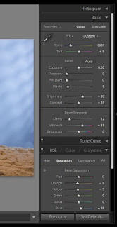
I probably should have warmed the main light a little more, with say, an extra 1/2 CTO to mimic lovely warm sunlight but as I had "2 stops of colour" between my background light and main light I was able to warm the shot by playing with the colour temperature in Light Room without losing the lovely blue background.

As you can see I didn't have to do much else to it:

It turns out that the original beach shot with the slime 'shopped out was actually selected to advertise the event but I am still very chuffed with the sand catle image and learnt a lot doing it.

Saturday, 17 May 2008

Going beyond simple

In a previous post I expoused the benefits of keeping things simple when lighting a product shot. One or two speedlights pointed at the ceiling give a large, soft and even light from above - ideal when you don't have a softbox. Today I wanted to a take a picture of a wooden box that I recently inherited. So naturally I started with something simple.


Here is the result with just the ceiling bounced light. As you can see it is even, soft lighting but the top of the box is too light. Armed with the knowledge learnt from Light Science and Magic I spotted that this was because the varnished surface was reflecting an image (specular reflection - mirror light reflections) of the wall/ceiling. The fix is to hold a black card in the family of angles that the box is reflecting.


This helped a lot and now we have a really nice simple shot of the box - achieved in minutes.


I decided I'd like to see if I couldn't spice the shot up slightly. I wanted to make slightly more of a feature of the design on the top if I could so I put a gridded flash on a tripod to the right of the box and aimed it at the top.


This just adds a bit more punch to the top which I liked. By this point it was getting late and I should have been in bed but I decided to try just one more thing. I gelled the gridded light with a CTO gel. This warmed the light which really brought out the tones in the wood.


Unfortunately this also gave me a hard shadow to the left of the box which I didn't want. Rather than solve the problem I tried to fill the shadow with another bounced flash which didn't really do enough. By this point it was far too late so I gave in.

So was the experiment a success? Sort of, I managed to get the simple, "safe" shot really quickly and then built on this with some extras that did improve the picture. But by the end I wasn't fully in control of the light and was left with a shadow I didn't want. Something to learn from for next time I guess.

Here is the setup:


And here is the postprocessing in lightroom (same for all shots):


Tuesday, 29 April 2008

Happy (belated) Pinhole Day

http://www.pinholeday.org/

I've had April 29th in my diary for the last 2 month as World Pinhole Day. It is years since I played with pinhole photography but I knew I still had a EOS fit pinhole in my bag so I figured I could join in with this worldwide event.

Unfortunately pinhole day was on Sunday not today. It was on the 29th last year but as it is always the last Sunday in April it landed on the 27th this year. The above image is not eligible for the official gallery but I thought I'd still post it here.

I must say that fitting the pinhole to my DSLR gave me all the blur with none of the cool vingette or wide angle distortion that I loved with my home built pinhole cameras. At least it didn't require me bringing a changing bag and a load of chemicals with me.

Tuesday, 11 March 2008

When the ring doesn't work


So I showed in the last post how the ring flash suited macro subjects there the detail was was more tonal rather than textural. This is what strobist calls the "3-D-yet-flat look" and it worked pretty well for some subjects I tried. however some things just didn't work at all. The best example being an orange. To properly capture the detail of the pitted, shiney, surface of this fruit I needed to use hard light at raking angles.

Setup

One strobe camera left with a black straw grid another left with the pop-out diffuser


Post Process

Nothing major - just a few tonal adjustments in lightroom.

Putting the ring to work


Since building my DIY ring fash I've not had a whole lot of time to use it but yesterday when I found myself with a few extra hours at home (courtesy of the storms that hit the south east of England and caused my train to be cancelled) I thought I'd have a play. I decided to try it out as a light source for macro shots.


I found it worked pretty well for some subjects. The ones which worked best were the things which had little surface texture. The ring doesn't provide the shadows & highlights needed to define texture. On the other hand subjects like this puzzle where all the texture is in the wood and the suface is smooth works brilliantly.


Setup


I shot tethered to the laptop so the images came up in Lightroom for detailed inspection. The setup was pretty much just the ring, camera, tripod and a couple of clamps. I used the torch as a focus assist lamp.


Post Processing

Besides the tone adjustments shown below I applied a farly shallow, smooth, S-curve in the curves control.

Tuesday, 5 February 2008

Ring-a-ding-ding

So just like everyone else I decided I should try my hand at making a DIY ringlight. My first attempt, before Christmas was based on the design by Paul Duncan. The main modification I made was to mount the whole thing vertically using a mic stand. I drew an elipse using the loop of string and a pencil technique and made sure the axes where in the ratio of 1 to the square root of 2. In use it was pretty good for a head shot so long as you had a big enough gobo to stop the flash lighting the subject directly. But for general use it was too big and too stationary.

I wanted a really portable ring flash that would be suitable for people and things. There is no shortage of designs knocking around the strobist community but the problem I had with most of them was the mounting the flash to the camera bit. I just couldn't be bothered messing around with bending bits of metal and sourcing bolts, nor did I think you could get away with leaving the flash in the hotshoe. I made a few prototypes of my own designs but then when I saw the ring light made by Tanya Shields I loved the simple design that allowed you to hold the flash in one hand and the camera in the other.

I had been on the look out for likely materials for a week or two then on a trip into London I visited the giant Paperchase store on Tottenham Court Road. The top floor has nearly every paper and other flat craft meterial you could want (but no coroplast). I found some A3 sheets of polypropolene for £1.25 each and bought up some in back, white and colourless translucent. I also got some mirror card (£3 for A2).

I started off by drawing around a dinner plate on the back of the mirror card. I also drew around a flash head to make sure the opening would be the right size.

Then I drew around the lens hood for my largest lens. I placed it in the centre of the dinner plate circle, well roughly in the centre.

Next I cut it out.

I then turned my attention to the translucent polypropolene. I drew around the mirror card shape then drew in tabs. I cut this whole shape out and scored the tabs so they would easily bend.

To make the mirrored sides I cut strips of mirror card with tabs down one side. I scored the tabs.

Sticking the sides to the back was not easy as I only had PVA to hand. I used the whole contents of the grocery cupboard to persuade everything to keep still while the glue set. If I did it again I'd use a different glue.

And then after much drying time the finished reflector.

I used tape to stick the tabs of the diffuser to the sides of the reflector. To stiffen everything up I glued some corrugated cardboard to the back of the whole unit. In the area the flash connects I glued on 2 more peices of cardboard to provide a firm support for the unit when hand holding it by the flash (making sure the "grain" pf thecorrugations went in different directions in each peice for maximum strength)

To test the ringflash I mounted it on a tripod with the camera on another tripod behind and shot a couple of self portraits. Later in the day I tried hand holding the flash and camera. I found both techniques were easy to do and got nice results.

I tried both a shot lit only by the new ringlight (top of post) and one balanced with the ambient (below). I feel I should explain the top picture: I started the ringlight on Sunday evening and had hoped to finish it off on Monday after work. Unfortunately on Monday afternoon I got ill at work and had to go to hospital in an ambulance. I didn't get home home from A&E until late so I had to postpone the ringflash project. I did however get a souvenir of my hospital visit so decied to use it in one of the portraits.

After the first couple of uses I refined the design slightly. I covered the unit in gaffer tape so it looked a bit nicer and I added some cardboard and gaffer tape ridges to the flash mounting area to more securely join the flash to the ring when hand holding.

Wednesday, 30 January 2008

Enter the Lightroom


I've been a committed RAW user for nearly as long as I've had my DSLR. Back in college I spent more than my fair share of time in the dark room and loved the creative options processing my own B&W photos gave me. For me RAW is the digital negative and the opions for digital postprocessing far exceed those available to me in the chemical days. I got Canon's Digital Photo Professional with my DSLR (a 20D) and it has been my raw converter of choice ever since. The updates to it over recent years have added many great features and when I tried the Lightroom beta this time last year, although I was impressed there were enough bits missing that I didn't buy in. A year on I figured it was time to look at LR again, as just for good measure I got the latest update of DPP to see how it was keeping pace. Long story short Lightroom 1.3 has come on in leaps and bounds wereas DPP 3.2 simply moves some features (in good way) around and adds some new stuff that sounds great but doesn' support my 20D. Sadly this is not enough and as of now I'm switching. LR simply has more sliders, more options - just more creative options! Its workflow is different from DPP and I'm getting used to that, soon I think I will be quicker, stronger, better in Lightroom. I often have several hundred shots to process from a day's shooting at a conference or whatever so workflow is really important but I'm sure LR can deliver. Below are 3 version of the same photo:


above: Unchanged

above: DPP - just couldn't get what I was looking for

above: LR - yay!